Atoms
The smallest useful piece. No composition, no business logic — it renders what it is given and reports back what the user did.
- In orn-ui
Button, Input, Badge, Avatar, Body- Rule of thumb
- Split it and you are left with nothing usable.
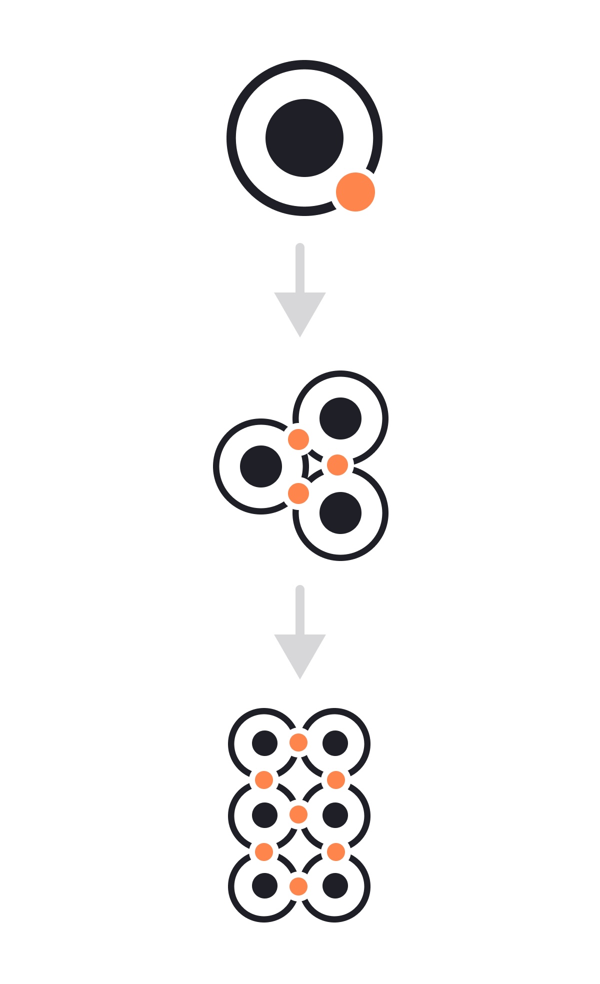
Atomic design organises an interface into a few layers that build on each other: small pieces combine into bigger ones, and nothing ever depends on something above it. orn-ui ships in those layers — and the same structure works in any frontend codebase, React Native or not.
Most component libraries try to cover web and mobile from a single codebase. That reach has a price on a phone: extra abstraction layers, web-oriented dependencies riding along into the bundle, styling engines resolving at runtime. You pay for portability you are not using.
orn-ui goes the other way. It is 100% React Native with zero runtime dependencies — react and react-native are the only peers. Nothing to compile, no styling engine to configure, no bundler plugin to add.
npx orn-ui add button copies that component's source into your project. No package added to package.json, no version to track — the code is yours to edit.
npx orn-ui add buttonpnpm add orn-ui is side-effect free and exports per subpath, so importing Button pulls in Button. Components you never import never reach your bundle.
pnpm add orn-uiWrap your app in UIProvider and every component has theme, icons, insets and labels. That is the entire configuration step.
Getting Started →The point is speed: laying out real screens without rebuilding a Button for the fifth time, and without spending an agent's context writing primitives from scratch that already exist, tested, in the layer below.
Brad Frost's original model has five levels — atoms, molecules, organisms, templates and pages. A component library can only own the first three: templates and pages describe your product, not a reusable package. So orn-ui stops at organisms and the last two layers stay in your app.
The smallest useful piece. No composition, no business logic — it renders what it is given and reports back what the user did.
Button, Input, Badge, Avatar, BodyA few atoms wired together for one concrete job. It may hold local UI state, but it never knows where the data came from.
InfoRow, SegmentedControl, Stepper, OptionCardA self-contained section of a screen. Composes molecules and atoms, owns the interaction flow, and is the first layer allowed to touch data or navigation.
Modal, List, SearchList, NavigationBar, Wizard// organisms/UserCard.tsx — may import both layers below
import { InfoRow } from '../molecules/InfoRow';
import { Avatar } from '../atoms/Avatar';
// molecules/InfoRow.tsx — may import atoms
import { Body, Caption } from '../atoms/Text';
// atoms/Avatar.tsx — imports nothing from the layers above
import { InfoRow } from '../molecules/InfoRow'; // neverA new component's home is decided by what it depends on, not by taste. That removes one of the most recurring review arguments in a growing codebase.
When every primitive lives in one folder, a second Button someone wrote inside a screen file is obvious at a glance instead of surviving for a year.
Because dependencies point one way, changing an organism can never break an atom. The blast radius of a change is bounded by the layer you touched.
One-way layers are exactly what a bundler needs to drop unused code. In orn-ui, importing an atom pulls in that atom and nothing else.
“It goes in molecules” is a complete answer. Someone who has never seen the repo can place a component correctly.
None of this is React Native specific. The same three folders work in Next.js, Vue, SwiftUI or plain CSS modules.
Three directories under components/, plus wherever your routes already live. Templates and pages are your existing screens — do not invent a new home for them.
src/
  components/
    atoms/        Button, Input, Badge, Avatar…
    molecules/    SearchField, OptionCard, InfoRow…
    organisms/    Modal, List, NavigationBar…
screens/ templates + pages (your routes)Imports point downwards only. Enforce it mechanically if you can: import/no-restricted-paths in ESLint, or dependency-cruiser, fails the build instead of making a reviewer notice.
Do not design an atom catalogue up front. Build a real screen, then pull out what it repeats. Anything used in three places has earned promotion to a lower layer.
Atoms are stateless and prop-driven. Molecules may hold local UI state — open/closed, focused index. Data fetching, stores and navigation start at organisms, never below.
A template is layout with holes in it; a page fills those holes with real data. That split is what lets you preview any layout without a backend.
22 atoms, 8 molecules and 18 organisms, each on its own page with props, variants and a recording from the simulator. Every one of them installs on its own.
Browse the components →The methodology is Brad Frost's, published in 2013 and expanded into a book that reads free online. The rest are the tools mentioned above and orn-ui's own source, which is where the component counts on this page come from.
The 2013 post that introduced the chemistry analogy and the five stages.
The book's full definition of atoms, molecules, organisms, templates and pages.
ESLint rule used to enforce the import direction between layers.
Validates and visualises dependencies; the alternative way to fail the build on a wrong-direction import.
The library itself; the layers described here are the folders it ships.
Search by component name or the JSX tag it renders, e.g. "Pressable" or "TextInput".
No matches.
orn-ui is free and open source. If it saved you time, a small donation helps keep it maintained.